Facilitate Action
Even if we intend to take up and use digital financial services, we sometimes fail to follow through. When signing up for a new product, we might drop off within the onboarding process if it includes complex steps or takes more time than expected. Even small hassles such filling out a form or authenticating a separate account can derail progress. Ultimately, we may put the action off for another day, or even change our minds entirely.
The challenge:
- People may be interested in new products, but even small hurdles can cause them to procrastinate or change their minds.
- Automation can ease hassles for some situations, but sometimes can create new hassles for consumers, especially when cash flows are tight.
- Uncertainty in the process and perceived lack of progress can be demotivating and encourage drop-off.
Warning signs:
- Drop off in your registration process, especially around particular steps
- Drop off in engagement before a required task
The Science Of
Hassle Factors
Seemingly minor inconveniences can prevent people from following through — even when they want to. Hassles can derail progress by amplifying the negative effects of common behaviors like procrastination and forgetting.
Dive deeperDesign Principle 1:
Help people overcome hassles
First, consolidate or eliminate as many steps as you can during the onboarding process while preserving user privacy and keeping all data secure. Put a particular focus on removing requirements that may involve multiple steps or uncertain steps. Taking advantage of autofill features can help when it comes to data entry. Next, make it easy for people to navigate the remaining steps by using plan-making tactics and available support.
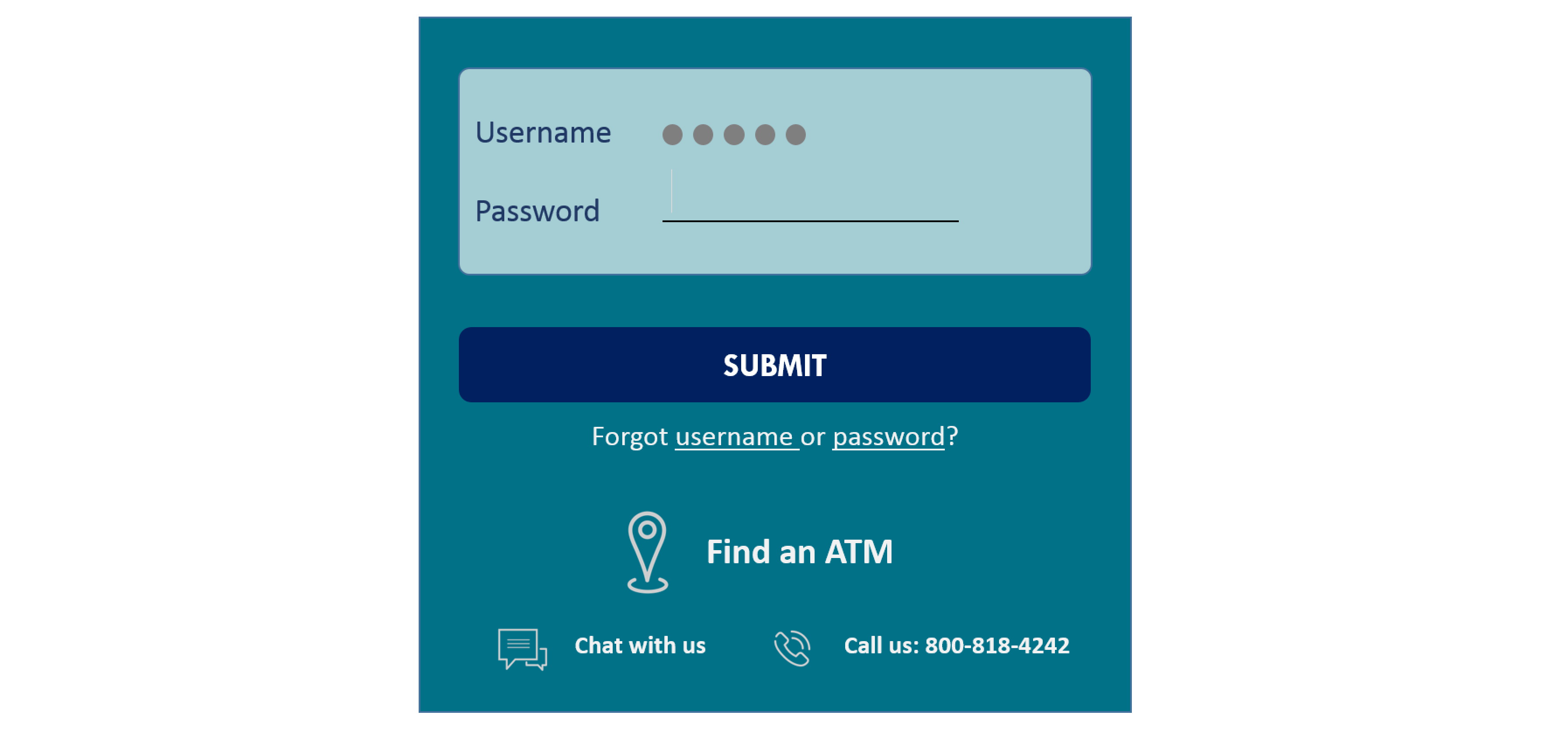
Key information such as branch locations and phone numbers can be useful to have on-hand as soon as a mobile banking app is opened (i.e. without signing in).

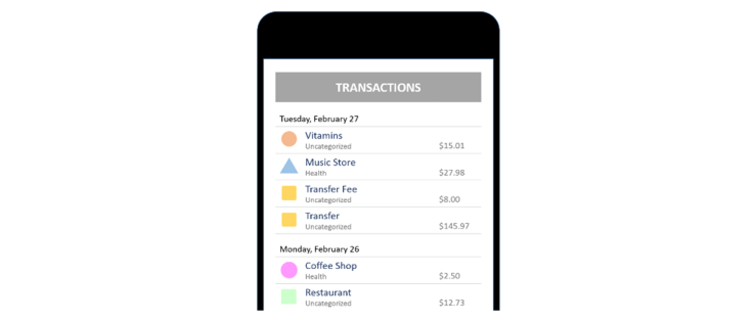
Fresh EBT is a free mobile app that helps people manage their SNAP (food stamps) benefits. The app makes it easier for participants to check the balance on their EBT card, see recent transactions, and determine their next deposit date. When a user signs up and enters an account number, Fresh EBT uses an algorithm to check instantly whether the account is valid. If it is not (likely due to a typo), a warning allows people to see and fix the mistake right away, instead of receiving an error message after submitting the full form.
This example does not constitute or imply an endorsement or recommendation of any product or service by ideas42.
Getting it right:
- At each moment, highlight one concrete next step to complete. If people need to take action offline, after a delay, or in coordination with others, give them a template for making concrete action Include details about when to act (date and time) and what to prepare, and help people anticipate and plan for obstacles.
- Provide materials such as return envelopes and stamps if needed, and make sure key information like addresses and phone numbers are readily available.
- Assume people will make mistakes. Find ways to spot and correct them early on so that users don’t encounter errors later.
- Let users move as far into the product experience as possible, even if this requires the use of placeholder data. By proving the value of your service first, you preserve the opportunity to ask for additional information as users explore the product.
Caution!
- Make it easy to connect to live support, and don’t overly restrict your team with scripts or protocols that can’t be tailored for the situation.
Design Principle 2:
Automate tasks – if it reduces hassles
Once users have taken up your product, look for opportunities to automate steps to cut down on user effort. When considering what features to automate and how to craft the experience, think about whether automation will reduce hassles or actually create more work for your user. For instance, automated bill pay may reduce hassles for many people because they no longer have to worry about keeping track of deadlines and logging into accounts to make payments. But this same feature can create a burden for low- and middle-income consumers who have to make sure funds are in place before payments are charged, while taking into account the timing of business days and weekends, delays in processing, and the risk of costly overdrafts (see more in “Other barriers to usage: Transaction settlement speed”, below). A compromise could be partially-automated solutions like a “click-to-confirm” savings transfer, which grabs the user’s attention at the right time and gives them control over whether the transaction goes through.
Many budgeting apps automatically assign expenses into budget categories. For new users, this is a huge hassle because miscategorized expenses require “teaching” the software with careful monitoring and manual adjustments. Even later, proper categorization can still require some manual steps.
Getting it right:
- Because people are likely to stick with default options, choose settings that are likely to be best for the user’s financial health and make it easy to change settings from one period to the next.
- Consider using reminders alongside or instead of automation.
Caution!
- Automation can create more work or threaten financial health in certain contexts. Consider the consequences users face if they forget about an automated setting and an unexpected transaction takes place. Similarly, what consequences does your user face if a task is NOT automated and they fail to take action on their own?
The Science Of
Commitment
Most of the time, we seek to act in ways that are consistent with how we see ourselves or hope to be seen by others. We may go so far as to change our behavior or modify our beliefs to maintain this sense of consistency. Therefore, if we make a commitment to perform a task, we often do it – even if the commitment is just to ourselves.
Dive deeperDesign Principle 3:
Foster a sense of progress
Give people a sense of the progress they’re making, from affirming that they’ve taken the first step already to reminding them that they’re close to completion. Reminding them of their own previous decisions and commitments can motivate them to stay on course. Similarly, showing a visual of what they haven’t accomplished yet can be a powerful motivator if well-structured.

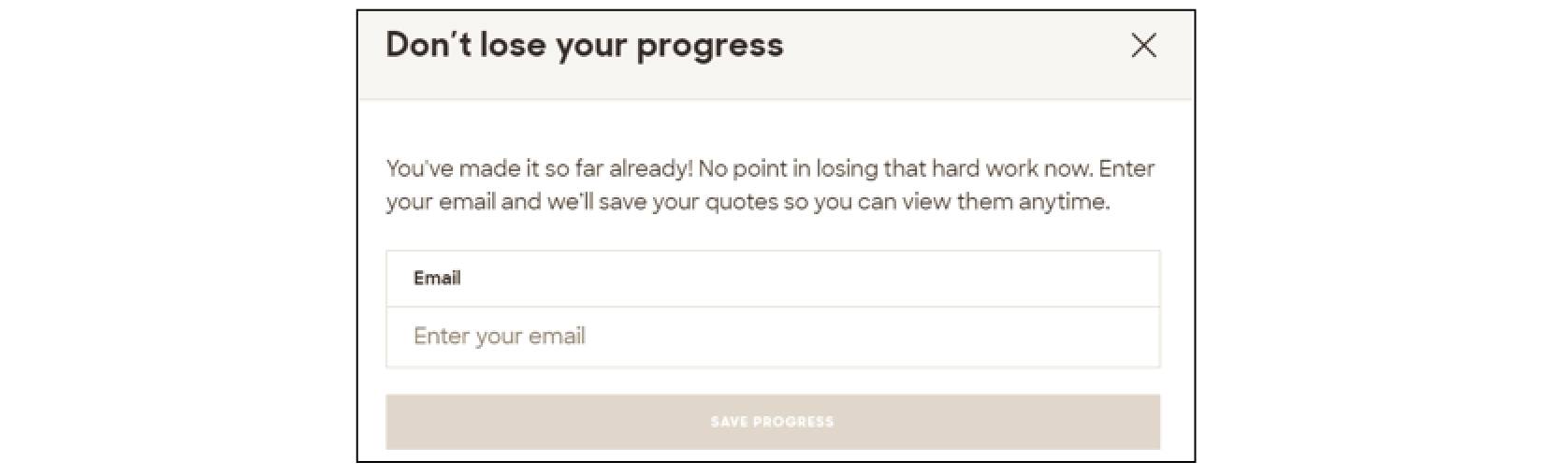
On the insurance website Policygenius, users enter basic information to request quotes. The message below the “next” button on the form reads “2 minutes until the finish line!” This provides a concrete expectation for how much longer the process will take and frames it as a small accomplishment that’s almost complete. Before leaving the site, a message encourages people to save their quotes. The prompt makes the user’s effort stand out and gives it a personal frame (“your progress”, “your quotes”).
This example does not constitute or imply an endorsement or recommendation of any product or service by ideas42.
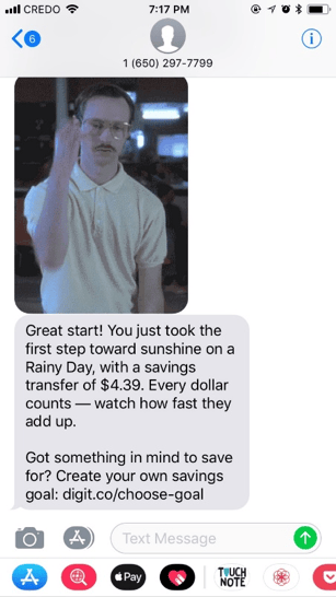
Digit, an automated savings platform, gives users instant encouragement by sending them a text message as soon as they finish onboarding. Affirming early progress can help users stay motivated and engaged.
This example does not constitute or imply an endorsement or recommendation of any product or service by ideas42.
 Pseudo sets present effort as part of an incomplete set, which research shows compels people to finish more tasks.
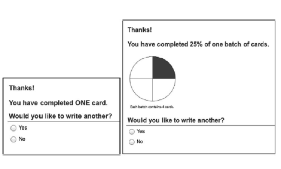 Pseudo sets present effort as part of an incomplete set, which
Getting it right:
- Provide encouragement from the very start by framing initial steps as complete.
- Use visual displays of progress (progress bars, etc.) to reinforce headway, help people orient themselves to where they are in the process and understand how far they have to go.
- If a user might not be able to fully complete a process due to a required step, provide a way to “save” their progress and return to it later. Pair this with timely and actionable reminders that link right to where they left off. If possible, let them dictate when they will receive the reminder.
Caution!
- It can be demotivating for people to feel that they have a long way to go before completing a task. At the start of a longer process, emphasize the progress people have already made by taking the first step, rather than the distance to completion.
Other barriers to usage: Connectivity and hardware
Users won’t always be online or have access to the right device when they want to use your product.
Designing for interruptions in connectivity and access to hardware can be especially helpful for low- and middle income consumers who may have pay-as-you-go mobile plans or limited data plans. These consumers are likely to rely on Wi-Fi, may share phones with others in the household, or may not always have access to a mobile phone. For example, in 2015, only 43% of unbanked households owned or had regular access to a smartphone. Only 28% of this group had home access to the Internet using a desktop, laptop, or tablet computer.
- Invest in the offline experience.
- Provide access to the service from multiple interfaces – app, mobile website, text commands, retail location, etc.
- Make sure account access is protected in case people lose phones.
- Design for the toughest scenario: cracked screens, users with vision problems, etc. A robust design will benefit all users.
Facilitating Action Checklist
Uncertainty about how to proceed can cause people to abandon a process
Creating a detailed plan can help people anticipate and navigate obstacles
Past work reminds users of their original decisions and commitments to take up your product
As people get closer to the end of a task, they are more motivated to complete it
Once a task has been automated, there is no risk of forgetting to complete it
