Simplify the Decision
Financial services can be hard to understand when they are unfamiliar or novel. When we come across information that is difficult to process, we may give up and turn our attention elsewhere. And processing new or complex information uses up cognitive resources, leaving less mental bandwidth for decision-making. Making it easier to scan and interpret information frees up resources for decision-making and action. When it comes time for the consumer to make a choice, it’s important to structure the decision so that options are not overwhelming and are clearly comparable.
The challenge:
- People often scan information quickly and may have a hard time understanding what new products offer and how to use them.
- Technical or legal language can easily deter people from learning more.
- While people like having many options to choose from, they actually struggle when faced with a multitude of options (or complex options) that are difficult to compare.
Warning signs:
- A large number of people dropping off at product description or pricing pages
- Some engagement with your product but low conversion rates
- Drop-off around a particular decision point or option set
The Science Of
Fluency
The ease or difficulty of processing information and completing a mental task can affect judgments and decisions in surprising ways. For example, we judge fluent statements that are easy to process as more true and likeable. We put off choosing or defer to the default when options are disfluent or hard to process. Many types of fluency can be at play, including linguistic fluency (e.g., words we know and don’t know), perceptual fluency (e.g., a blurred or sharp image), and conceptual fluency (e.g., ideas that are familiar or unfamiliar).
Dive deeperDesign Principle 1:
Facilitate understanding
It requires less cognitive effort to navigate an interface that is well organized. Eye-tracking research shows that Americans read in an F-shaped pattern and scan information rather than read in depth. Use common design patterns and plain language, label icons, and break text into sections with headers to help users quickly understand and absorb the key information.
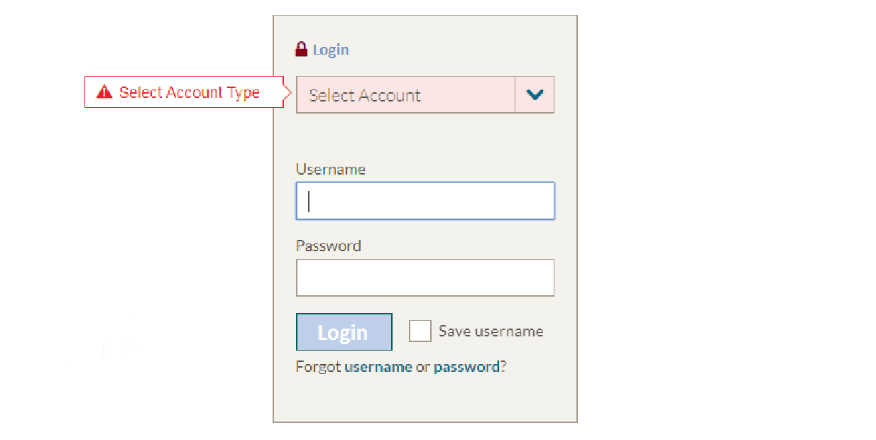
On this form, the eye is drawn to the blank field first, and goes to the account selection field only when an error pops up. This requires people to go back, find the error, and fix the form instead of quickly accessing their accounts.
Getting it right:
- Put key information at the top of the page and along the left side, where people tend to focus their attention, and use headers, lists, and bolding to help users scan information.
- Use common speech and concrete examples to help people quickly grasp the meaning (e.g., “Proof of residency, such as an electric bill with your name and address on it“).
- In forms, left-align all field labels and place them on top of the blank field. Leave suggestion text out of the fields, as our eye skips over this content to blank form spaces.
Caution!
- Don’t use graphics and icons without text labels — it takes work to read and interpret new images, and some icons may not resonate with users at all. Instead, use text alongside graphics for most icons, and use graphics instead of text only for universal icons like “print,” “close,” and “play/pause/stop”.
- Legal language and technical industry jargon are not only off-putting and confusing, but they can also cause users to drop off or procrastinate. For those working in the financial services sector, it can be easy to forget that many Americans do not share the same financial vocabulary, even if they understand the underlying principles. Strike the right balance between using plain language up front and providing channels to access more detailed information for those who want it or when you’re required to share it.
The Science Of
Choice Overload
As humans, we are often attracted to situations that offer us many options to choose from. However, when we face a multitude of options or options that are hard to compare, we struggle to decide. In the end, we may fail to choose, postpone the decision or simply stick with the status quo.
Dive deeperDesign Principle 2:
Curate the choice
In theory, the most straightforward way to reduce choice conflict is to simply remove the choice entirely, effectively limiting choice for consumers. In practice, this is usually unrealistic or undesirable. Instead, structure the choice in a way that helps consumers decide, and highlight the most important attributes that drive the decision.
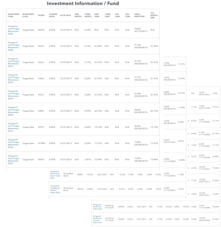
Employer-sponsored retirement plans often allow employees to choose from a long list of investment options. Fund information is available, but full of technical terms and fine print. Research shows that plan participation declines as the number of options available increases – in one study, the participation rate dropped by about 1.5 – 2.0 percent for every 10 additional funds.
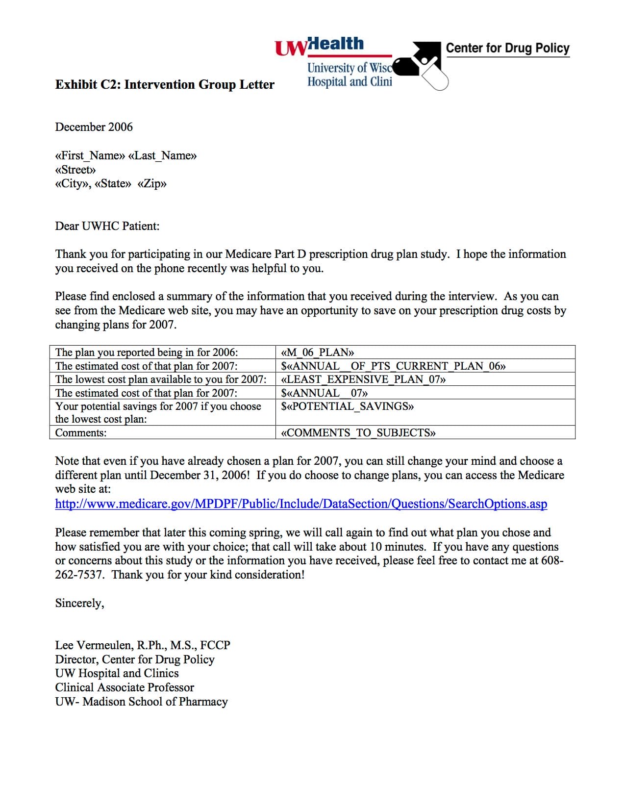
Medicare Part D is a government program designed to provide prescription drug coverage. It offers a wide range of plans that differ along a number of dimensions like monthly premiums, co-pay schedules, drug coverage, and pharmacy accessibility. The choice was confusing, and people signed up for plans that were too costly or didn’t suit their needs. Two of ideas42’s founders ran an experiment during the open enrollment period. They sent personalized information to one group of people about the three best options for them. A control group was offered instructions on using the Medicare website to research plans themselves. People who received curated information about their three best options switched their plans at a higher rate, and ended up with an average cost savings of more than $150 per person or 9% of the annual drug bill.
Getting it right:
- When the sheer volume of options is problematic, reduce the number of options or provide an easy way to sort and filter through them.
- Trim unnecessary information about the options and highlight the most important attributes for the decision.
- Specifically, draw attention to features that are important for financial health, so the user isn’t focused only on short-term benefits.
Caution!
- Don’t ignore the attributes your users prioritize. For example, the clarity of pricing structures, liquidity, and processing speeds may all matter more than the price itself. Use qualitative research to identify the features that matter to your users, and demonstrate how you meet these needs.
Design Principle 3:
Find a balance between active and passive choice
From organ donation to retirement savings, automatic enrollment or “default” options have won broad attention as a way to nudge consumers toward a particular outcome while giving them the opportunity to opt out. However, there are moments when providers may not be comfortable with defaulting consumers into a particular pathway (see Putting the interests of your users first). An alternative approach to defaults is an active choice framework, which requires the user to actively decide between options. An enhanced active choice framework goes one step further by requiring the user to choose, but also highlighting key attributes of each option.
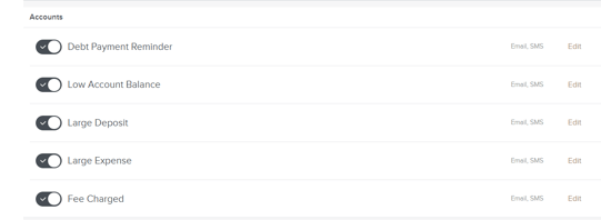
Some banks employ a strong default and automatically enroll people into receiving alerts.
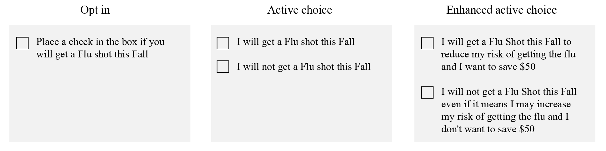
Researchers asked participants to imagine they were interested in protecting their health and told them that, according to the Center for Disease Control, a flu shot significantly reduces the risk of getting or passing on the flu virus. They were also told that through an employer-sponsored program they could possibly save $50 off bi-weekly or monthly health insurance contribution costs. 42% opted to receive a flu shot in the first group, while 62% and 75% opted to get a shot in the second and third groups, respectively.
Getting it right:
- Understand which attributes matter to your users, and what the implications are if they go with the default option.
- For enhanced active choice, draw attention to features that are important for financial health, so the user isn’t focused only on short-term benefits.
Caution!
- In deciding between these approaches, consider the ethical implications of how involved you want your user to be in this decision (see Putting the interests of your users first).
Simplifying the Decision Checklist
People tend to read in an “F-pattern” and focus their attention on the top and left side of the page
Technical language takes time and effort to understand. Most people will stop reading when they see jargon
Oppenheimer, D. M. (2008). The secret life of fluency. Trends in cognitive sciences, 12(6), 237-241.
Although people like having choices, they have difficulty choosing among a large number of options
People have difficulty choosing among options with a complex range of attributes
