Inspire Trust and Confidence
When people come across digital financial services, it can feel risky to trust a new provider or a virtual process with no human touch points and no tangible paper trail. The stakes are especially high when cash flows are tight. Any delays or errors in processing can result in fees and penalties that may affect long-term economic security. Each individual touch point, whether it is a website visit, a log-in, or an email, represents an opportunity either to reinforce or break feelings of trust and confidence.
The challenge:
- People often look to others to inform their behavior, but in a virtual environment, it’s harder to know what products and services peer groups are using.
- While many digital financial services provide increased clarity and control for their users, online processes may feel more opaque than services delivered in person at a brick-and-mortar financial institution.
- People are concerned about the security and privacy of their data, but may not know exactly what to look for to ensure security.
- A product’s look and feel sends subtle signals about who should use it, which may not resonate with a consumer’s identity.
Warning signs:
- People spending very little time on your website
- Some interest in your product but low conversion rates
- Feedback from consumers that they’re “not sure if this is real” or “afraid it might go under”
The Science Of
Social Norms
When we’re not sure of what to do or how to behave, a critical source of information comes from the behavior of others. “Injunctive” social norms tell us what we should be doing, while “descriptive” social norms tell us what others are doing. Social norms can be a powerful driver of behavior, but their effectiveness can depend on how much the consumer identifies with the social group in question.
Social norms can also backfire if the behavior you’re trying to promote is in the minority. In this case, you can use dynamic social norms that describe a change in behavior over time (for example, “The number of Americans who use online banking apps has increased by 37% from 2013 to 2015”).
Dive deeperDesign Principle 1:
Show that others have chosen to trust you
People manage their finances in private, which makes it hard for people to see what others are doing. This makes it especially important to provide clear signals of quality. Show that others trust you and that it’s safe to follow suit by encouraging word of mouth referrals, highlighting user reviews and press mentions, and including visible indicators of usage when they are likely to send a message of growth (count of users logging in, saving money, etc.). Other signals of credibility could include funders, partnerships or other prominent supporters. Remember that the supporters you highlight will also send a message to users about your target market, and could either encourage or discourage use (see “the Science of: Identity”, below).
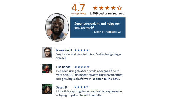
This summary shows a large number of total reviewers and positive feedback from individual users. Names and photos, plus small, concrete details like location, increase perceptions of closeness and similarity with the reviewer, while the star rating provides an easy-to-scan visual cue.
Getting it right:
- If your user base is small because you’re just starting out, tell a compelling story of growth or highlight individual users’ stories. This is also an opportunity to use a “dynamic” norm to tell a story of growth (“Americans are starting to invest more in their retirement…”).
- Ask users to help you spread the word. Even if they love your product, it may not occur to them unless you ask, and they may not follow through unless you make it easy for them. Give them links to forward or key search terms to talk about.
Caution!
- Don’t share anonymous reviews – they strip out the social aspect of this type of information and can create distrust. If possible, share select information about the reviewer, such as a first name or hometown so readers can personally relate to them.
- Visible social norms can backfire when they reveal low uptake or engagement. Empty comment boards or outdated reviews send an undesirable message about what others are doing.
- Be careful about referencing social groups that the user might not identify with. For example, featuring a Wall Street Journal article on a website may appeal to some user bases but not others.
The Science Of
Reciprocity
People tend to reciprocate positive social gestures. In fact, we will often go out of our way to return a small favor. Research suggests that while we’re especially sensitive to this dynamic within established relationships, the impulse to reciprocate still holds when we interact with complete strangers.
Dive DeeperDesign Principle 2:
Give transparency to the process
Sharing tangible cues about high-level processes prompts users to think about and appreciate the effort that goes into a service. As a result, they tend to value the service more highly, be more trusting and patient, and feel more satisfied with the user experience. Helping users imagine or check the system’s progress on key steps in a new or unfamiliar process can also increase confidence in expected outcomes. This can be especially important for consumers who are new to digital channels, those who have low initial trust in providers, and low- or middle-income consumers who can’t afford to have delays or mistakes in their finances.
![]()
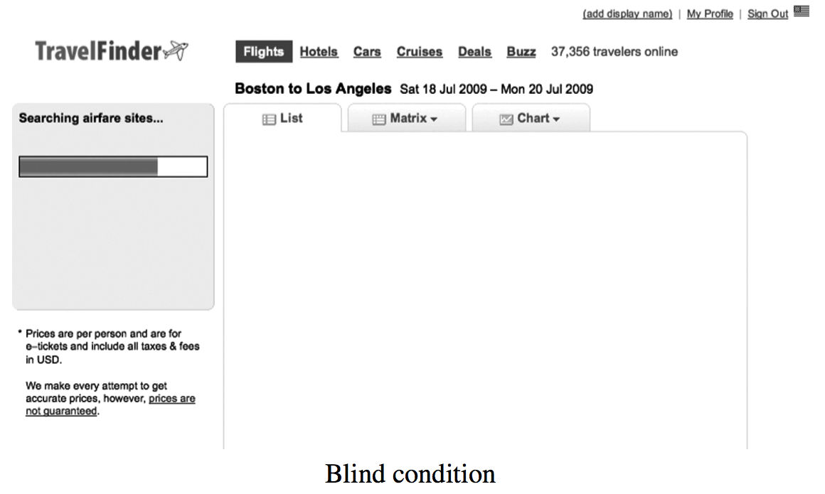
Researchers used the interface of a travel website to test whether “operational transparency” affected perceptions of value. They found that listing the airlines being scanned as participants waited for search results increased perceptions of quality and value. Users often valued the transparent service even more highly than a faster version with no information on the process.
This example does not constitute or imply an endorsement or recommendation of any product or service by ideas42.
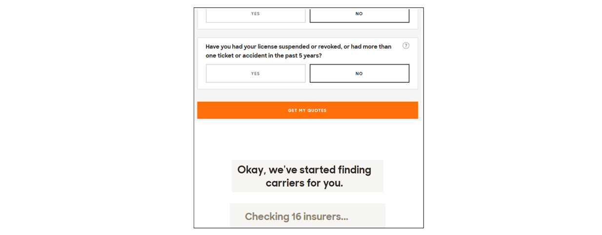
When users submit information on the insurance website Policygenius, the site frames an automated search process in “of ine” terms that users can conceptualize.
This example does not constitute or imply an endorsement or recommendation of any product or service by ideas42.

A “paid” stamp was one of the strongest physical cues that customers at a large bank appreciated about in-person transactions. ideas42 helped add similar visual cues to their online banking interface.
Getting it right:
- Consider what offline processes people are familiar with and what tangible cues they may appreciate and look for in a digital channel.
- Share cues about the process if your user has to wait for results, or to demonstrate effort when a user would expect the website to “do work” before producing results (for example, searching many sites for a price comparison).
Caution!
Don’t confuse or overwhelm your user with technical details or exact operations. Instead, provide representative cues in “live” time, as they fit into a layperson’s understanding of the process.
The Science Of
System 1 and System 2 Thinking
Most of the time, people think using “System 1”, which is an automatic, quick mode of processing information. System 1 thinking requires little mental energy, but can lead to errors in judgments or decisions. “System 2” thinking is slower and more deliberative, but requires conscious effort. Many of the behavioral biases people exhibit are due to System 1 overshadowing System 2.
Dive DeeperDesign Principle 3:
Use visual cues to signal security
People make quick, automatic judgements about the security of a website based on visual cues, such as an image of a lock or the overall sense of professionalism on a page. Because this initial perception is sticky, spend time perfecting the surface-level cues. Then, identify specific moments when you need users to engage more deliberatively and slow them down at those moments to ensure security.
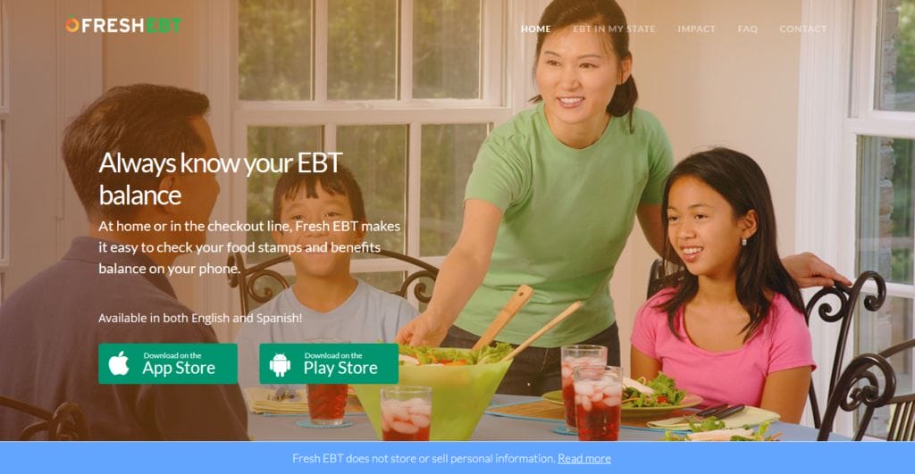
Fresh EBT is a free mobile app that helps people manage their SNAP (food stamps) benefits. The app makes it easier for participants to check the balance on their EBT card, see recent transactions, and determine their next deposit date. Fresh EBT shares a straightforward and simple privacy statement on its home page (“Fresh EBT does not store or sell personal information”). The statement is highlighted in blue and positioned at the bottom of the page so it stands out but doesn’t interrupt the flow of information.
This example does not constitute or imply an endorsement or recommendation of any product or service by ideas42.
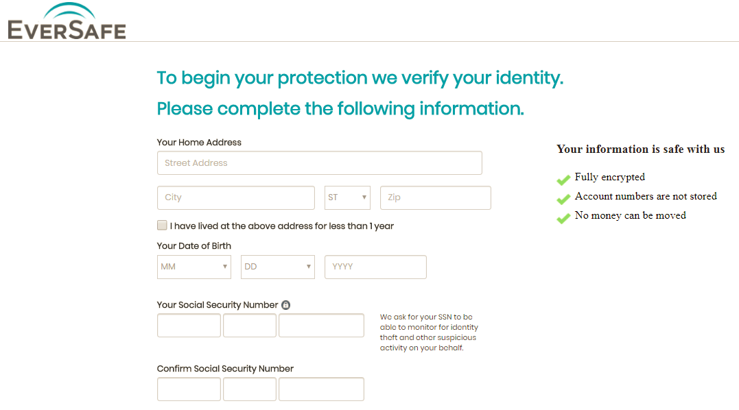
EverSafe is a service that protects consumers against identity theft and fraud. Their registration form highlights a short list of security measures, includes a visual lock icon next to sensitive fields, and gives a reason for requesting social security numbers (“to monitor for identity theft and other suspicious activity on your behalf”).
This example does not constitute or imply an endorsement or recommendation of any product or service by ideas42.
 Digit, an automated savings platform, shows users a visual image of a lock and highlights the standard industry language users may expect to see.
 Digit, an automated savings platform, shows users a visual image of a lock and highlights the standard industry language users may expect to see.
This example does not constitute or imply an endorsement or recommendation of any product or service by ideas42.
Getting it right:
- Design for System 1 (Fast Thinking): Use visual cues to signal a secure environment, and make it easy for users to follow best practices. For example, you may want to send smart reminders to install app updates that improve security or help people plan ahead to address security issues. Don’t require sensitive information if you don’t need it, and don’t ask for it before you’ve established a sense of trust.
- Design for System 2 (Slow Thinking): Slow people down when you need them to be more deliberative for security reasons. Provide the option to access more information when users may want to engage more deeply. Explain why you need sensitive information, and be explicit about how the data will and won’t be used. Share rules of thumb about what visual cues to always look for and what information never to share. Keep in mind that staff members are also human, with their own set of System 1 and System 2 challenges. Set security permissions to expire automatically so that they must be re-set. Use checklists as a safeguard. Make the consequences of a security breach concrete.
Caution!
- While automatic app updates for security may seem like a good idea, be cautious because some users may have limited data plans, low device storage, or older device models that might not accommodate large updates. Use settings that only push downloads when Wi-Fi is connected, and make it clear when an update is critical for security.
- Use warnings judiciously. Too many warnings that cover both minor and serious issues can cause fatigue, and people may become accustomed to automatically dismissing all.
- Keep explanations short to avoid overloading your user. A straightforward phrase or sentence is often enough to reassure users (“We do not store account information”). Provide easy-to-find links with your security settings and privacy policy so users know where the details are if they need them.
The Science Of
Identity
Each of us has a multi-faceted identity: we are caregivers, savers, employees, neighbors, and much more. As different situations prompt us to assume particular identities, the values and goals associated with each role dial our choices in subtle ways. We seek to act in accordance with the way we see ourselves, which depends on the identity that is most “top-of-mind.”
Dive DeeperDesign Principle 4:
Match the tone and style of your users
The overall look and feel of your product evokes an identity that either resonates with your user or alienates them. Familiar details in language, presentation, and framing can encourage feelings of closeness and understanding, while unfamiliar or negative cues can create a sense of distance and distrust.
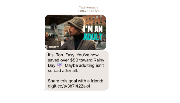
The images and phrasing in this text message from Digit, an automated savings platform, are designed to resonate with a specific audience of younger users.
This example does not constitute or imply an endorsement or recommendation of any product or service by ideas42.
Getting it right:
- Invest in first impressions. From the first glance, small details like images, amount of text, and level of polish can signal whether a product is designed for “someone like me.”
- Consider hiring from the communities you serve. This is one of the most straightforward and authentic approaches to finding the right voice.
- Getting the tone and style right matters for second language experiences, too. Some financial terminology doesn’t translate well, and poorly executed copy can reduce the credibility of non-English versions. Enlist native speakers and check that graphics reflect the local context, too.
Caution!
- Some products inadvertently call to mind a negative identity that makes us want to keep our distance. For example, a consumer receiving government benefits may choose to charge groceries to a credit card with high interest rates rather than use an Electronic Benefits Transfer (EBT) card due to sensitivity around using social service programs. Be aware of these subtle signals and how consumers may react.
Other barriers to usage: Transaction settlement speed
While there is a long history of behavioral science applications within marketing and user experience design, significant behavioral barriers can also arise in underlying product functionality. For instance, speed is the second most common reason that underserved households give for using non-bank check-cashing services (after convenience). When given the choice, 90% of consumers on a banking and payments technology platform chose instant deposit with a fee over free deposit in seven business days.
Speed is critical because many low- and middle-income consumers lack a savings cushion or credit source to cover obligations amid volatile cash flows. These consumers end up needing immediate access to their funds on payday. Unfortunately, few traditional banking products offer instant liquidity. For reasons ranging from fraud protection to systemic delays, most consumers cannot immediately access 100% of funds deposited via paper check in a traditional checking account. Rules surrounding check deposit availability are both complex and vague, leaving consumers unsure when they will be able to access their money.
Inspire Trust and Confidence Checklist
Knowing that others trust you can encourage users to follow suit
Getting a sense of the effort that goes into delivering services can build feelings of appreciation and reciprocity
People may be accustomed to physical cues such as receipts and “paid” stamps, and want to see proof of completion
People make judgments about the security of websites quickly and automatically using salient visual cues
Providing an explanation can give users a reason to respond
Cialdini, R. B. (2007). Influence: The psychology of persuasion. New York: Collins.
Users are more likely to engage when the tone of your service is familiar to them and resonates with a positive self-image
