Capture Attention
Financial tasks usually capture our attention when there is an immediate, short-term need such as paying a bill that has come due. If we have established routines for managing our finances, it’s especially easy for us to continue down those paths without much thought. In fact, most of us are not making a deliberate choice not to use digital financial services – those opportunities for usage simply never make it into our line of sight. The attention challenge is even more pronounced in a digital environment where physical cues and human interaction are limited, and an increasing number of digital products and services compete for visibility. Finding specific moments that align with a real-world need can help bring digital financial tools to the forefront of our attention and increase engagement.
The challenge:
- We have limited capacity for attending to the world around us, and digital financial services may never even enter that line of sight.
- Reminders and alerts may pop up for a moment, but may not arrive at the right time, with a compelling message, or with a natural action step – and ultimately may be forgotten.
- Even if a new product does capture attention, we tend to overestimate the costs of switching to something new and choose instead to stick with products and services we already use.
- In the absence of human interaction, outreach that feels impersonal or institutional can fade into the background.
Warning signs:
- Low engagement with marketing campaigns
- Low traffic on your website
- People using your product only one or twice
- Feedback from consumers that they already have another solution in place
The Science Of
Limited attention
People tend to notice and respond to one aspect of their environment at a time. We automatically pay attention to what stands out – not necessarily what’s most important. As a result, we can completely miss critical information or even physical objects that are right in front of us.
Dive deeperDesign Principle 1:
Align with a moment of need.
Consumers aren’t necessarily scanning the marketplace for new solutions, even if there are faster, more convenient options out there. To enter a consumer’s consideration set, find a moment when they are looking to meet a specific need, and make sure your product breaks into their line of sight and facilitates positive action within that moment. Of course, that needs to be a moment when they have sufficient time – and mental bandwidth – to complete the action successfully.
 Fresh EBT is a free mobile app that helps people manage their SNAP (food stamps) benefits. The app makes it easier for participants to check the balance on their EBT card, see recent transactions, and determine their next deposit date. Users often tell others about Fresh EBT when they see friends and family trying to call into a voice service to check balances at the start of a grocery trip. Sharing this information at exactly the right time and place brings the recommendation into focus.

This example does not constitute or imply an endorsement or recommendation of any product or service by ideas42.
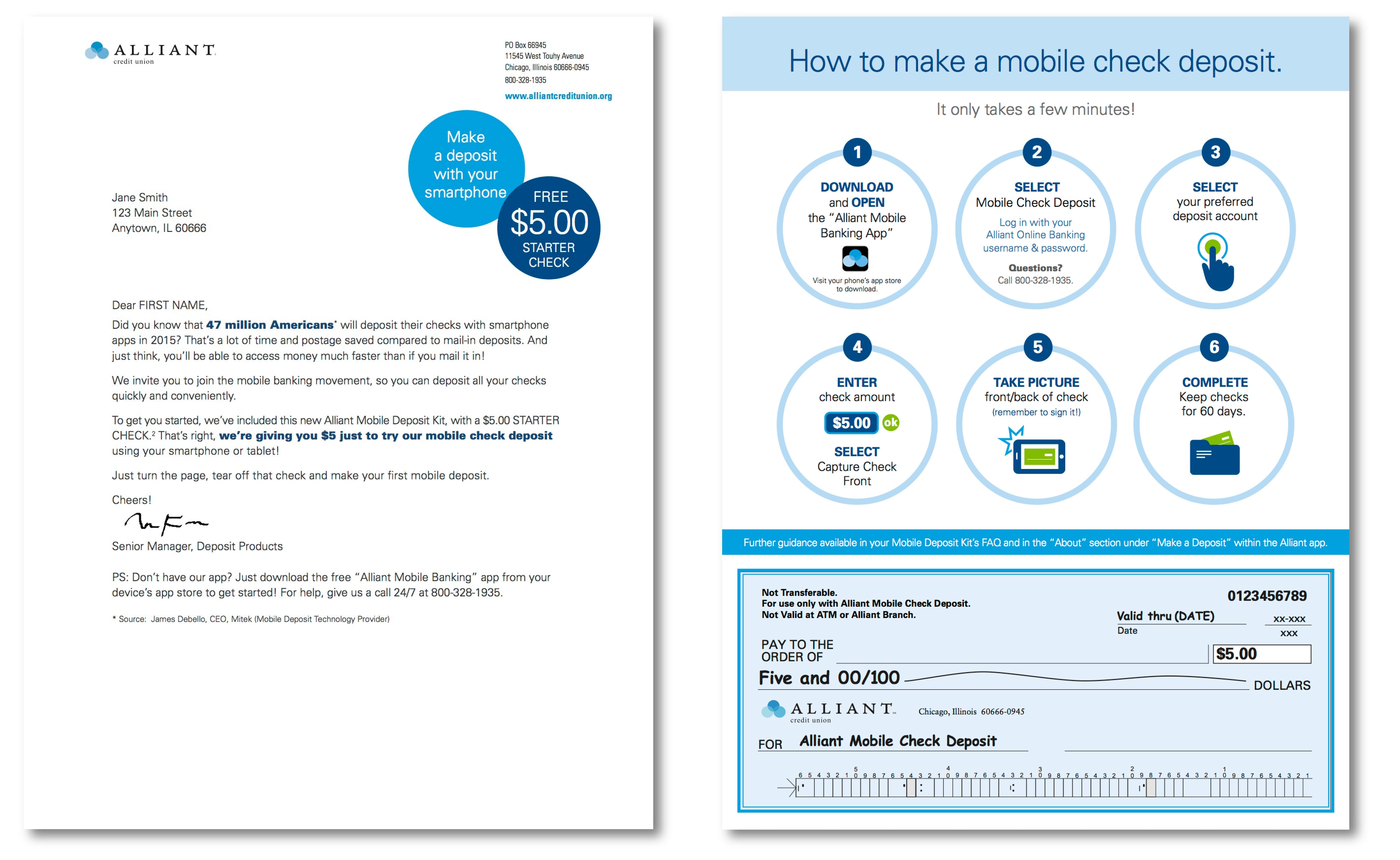
ideas42 partnered with Chicago-based Alliant Credit Union to increase the use of their mobile deposit feature. Members either weren’t aware of the feature, had tried it but gotten confused, or simply defaulted to habitual ways of making deposits when checks came their way. To overcome these barriers, we created the Mobile Deposit Kit with illustrated step-by-step instructions for making a deposit and a $5 check so customers could try the service right then and there. Over six months, credit union members who received a kit deposited 60% more of their checks through this digital tool. While the $5 check helped grab attention, it also gave members a concrete opportunity to try mobile deposit. Facilitating the action just once proved effective in breaking down behavioral barriers to use.
This example does not constitute or imply an endorsement or recommendation of any product or service by ideas42.
Getting it right:
- Once you’ve identified a specific moment of need that your product solves, make sure that it’s easy for users to quickly understand what your product does (see Simplify the Decision) and give them a clear next step to complete (see Facilitate Action).
- Test your assumptions about what the right moment is by conducting observations and asking for user feedback. Introducing the digital solution should feel natural and intuitive, not forced.
- Offering discounts, prizes, or gifts to try a new product is a common practice. But while economists may think of incentives as a way to sway a consumer’s cost-benefit analysis, it’s not necessarily the amount of the incentive that matters – it’s the attention-grabbing effect. Behavioral science research suggests that even small rewards or prizes can be an effective (and relatively inexpensive) way of drawing attention to the opportunity to take up or use a tool, especially when delivered at the right time and aligned with an actual need.
Caution!
- Be mindful of overloading the user when they’re in a rush, trying to do something else, or have limited mental bandwidth for a new task. Trying to divert attention in a “low bandwidth” moment can backfire.
- Incentives can help if the problem is that users don’t know about your product or underestimate the value of trying it. However, they won’t lead to sustained usage if you have bigger barriers to overcome. Even micro-incentives add up over time.
- Partnerships can open up new channels to offer your product and reach consumers at the right moment. However, remember that it’s not just the product end user who has limited attention – it’s all of us. Front-line staff and other employees at your partner organization also need to have the bandwidth and buy-in to deliver your product effectively.
Design Principle 2:
Reminders and alerts need to be “smart”
As financial management moves into a digital environment, the loss of physical cues or in-person interactions makes it easier to overlook financial tasks. Leveraging features such as real-time notifications and reminders has been shown to keep finances top of mind and boost financial health. However, these features must be well-timed, vivid and well-structured: grabbing people’s attention at the moment when they can take action, and ideally providing a channel to complete the action
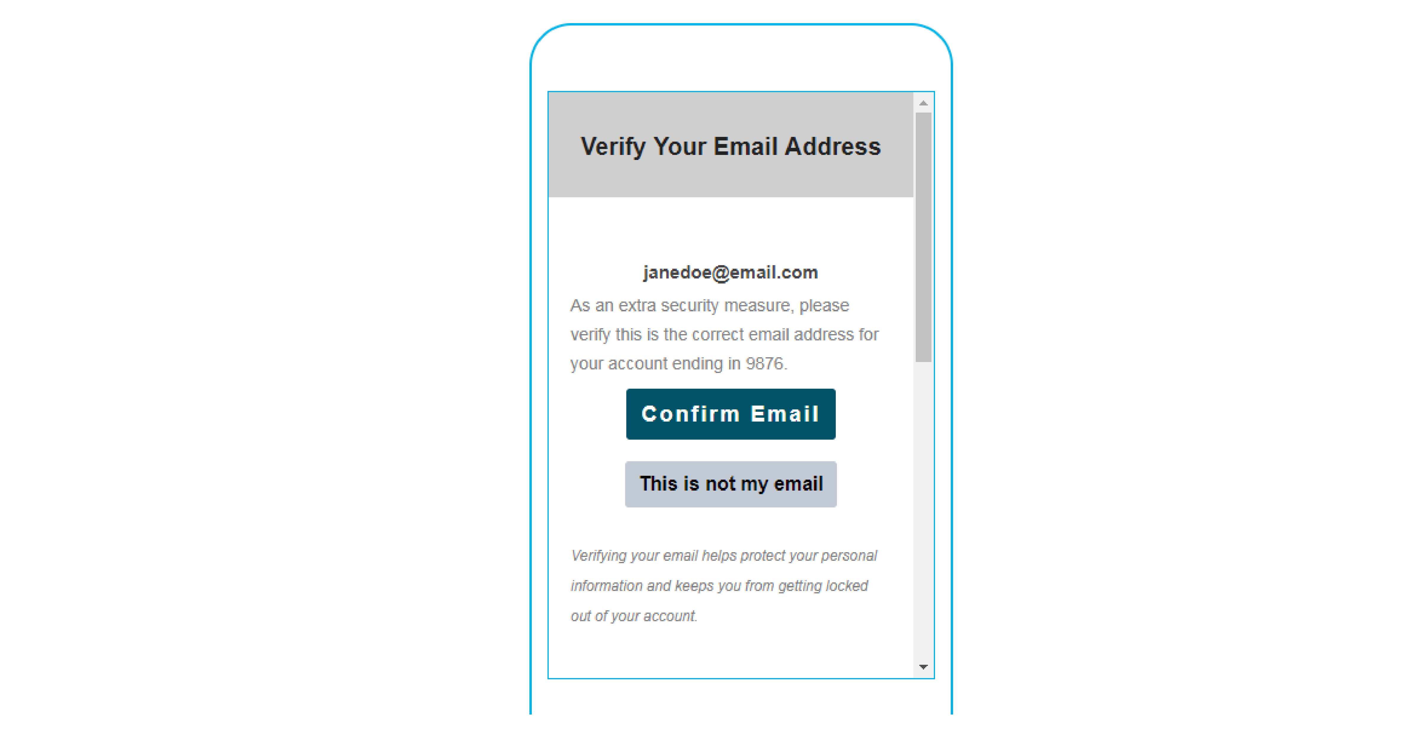
 Many companies give users clear action steps for confirming email addresses, including an opportunity to flag if something isn’t right. In this example, the explanation of why this step is important comes after the action step, but doesn’t interrupt the flow.
 Many companies give users clear action steps for confirming email addresses, including an opportunity to flag if something isn’t right. In this example, the explanation of why this step is important comes after the action step, but doesn’t interrupt the flow.
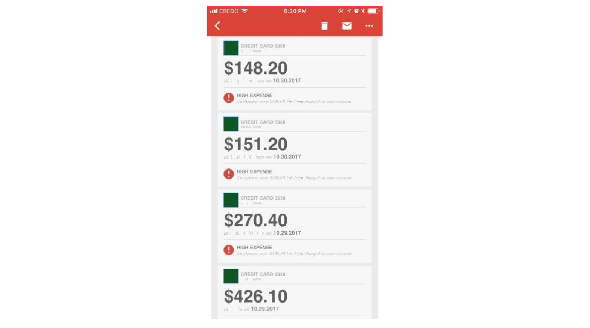
Pushing alerts at a set time each day or each week in batches, rather than in real-time, is unlikely to help the user take corrective action and can overwhelm the user.

Budgeting apps often send alerts when you’re over budget, but not all allow you to create an alert when you’re approaching your budget and corrective action can be most helpful.

In the United Kingdom, a regulatory authority has introduced a new rule requiring banks to set up an alert system to notify consumers before they incur an overdraft fee. While many banks already have alert systems in place, the rule will require all banks to send alerts via text message or a mobile banking app.
Getting it right:
- If you’re sending a reminder to complete an action, set your user up for success. Think about when they are likely to receive your message and where they will be. A/B test your hypotheses about the optimal time to reach out, and facilitate that action step by including a direct link when possible.
- If you are sending an alert that may raise concerns (e.g., account privacy or security issue), share a concrete next step (e.g., verify this purchase, change your password) and make it easy for the user to contact you with questions.
Caution!
- Constant low balance or expenditure alerts can be a distraction that causes people to tunnel on their finances. Give people control over when alerts are triggered so they can set meaningful thresholds for their financial situations.
The Science Of
Status Quo Bias
Sometimes, we like things the way they are simply because that’s the way things are. There are many reasons for this. We disproportionately value things we have over things we don’t have, a phenomenon that psychologists call the endowment effect. We also like to be internally consistent. Since making a switch would imply that previous decisions weren’t the right choice, we’ll avoid the change to avoid facing that inconsistency. And because we tend to overestimate the costs of switching, sticking with the current state of affairs feels easier than switching to something new, even when there are better options out there.
Dive DeeperDesign Principle 3:
Interrupt the habit and redirect attention
We sometimes use regular routines to manage our finances, such as going to the bank at lunchtime every Friday. Even when there are better alternatives out there, we tend to automatically stick with what we know and overweight the cost of switching to something new. Interrupting old habits provides an opportunity to reset the user experience and introduce digital financial services that can save users time and/or money while better supporting financial health.

Sometimes, when people receive a check, they automatically go to the bank simply because it’s the way they’ve cashed checks in the past. At one financial institution, customer care representatives identify people who are waiting to cash a check with a teller and suggest they use mobile check deposit instead. If a customer does not have the mobile banking app, the representative offers to set up the app with them on the spot. Representatives walk customers through registration and help them with the first mobile check deposit. Because data usage can be a concern, Wi-Fi is typically available to support app downloads. Customers are able to fully complete the action and, if they encounter hurdles, access support immediately.
Getting it right:
- Start by identifying the cues that prompt old habits – often a place, time, or preceding action. In qualitative interviews, rather than asking people why they took a certain action, ask questions about the process (“Walk me through the last time you made a deposit. What was the first step you took? Where were you? What time of day was it? What did you do next?”). Think about how to change these cues and the environment in which people take action, rather than just persuading them to switch.
- People tend to believe it’s harder to switch to a new technology than it actually is. Reduce the misperception by helping people navigate one-time administrative hassles such as registration and account authentication. Having support available to troubleshoot can help alleviate anxiety.
Caution!
- Don’t put the burden on your user by asking them to establish new habits or actively spot opportunities to continue using your service.
- Some patterns of behavior aren’t driven by pure habit alone. For example, if banking in-person offers a social connection that is important to the user, trying to change the routine is unlikely to support a change in behavior. Identify what aspects of the experience can be captured in a digital channel so that you can free up in-person resources for the highest-impact exchanges.
The Science Of
Reciprocity
People tend to reciprocate positive social gestures. In fact, we will often go out of our way to return a small favor. Research suggests that while we’re especially sensitive to this dynamic within established relationships, the impulse to reciprocate still holds when we interact with complete strangers.
Dive DeeperDesign Principle 4:
Incorporate the human element.
We may not notice generic communications, but when it seems like someone put extra effort into reaching out, or when we know that someone is waiting for our reply, we’re more likely to pay attention and respond. Even if we don’t know the sender personally, including visuals like a photograph or personal details can invoke a response.
 The Behavioural Insights Team and the UK court service conducted experiments to test the effectiveness of low-cost strategies for increasing payment of delinquent court fines. They found that a personalized text message that addresses the recipient by name significantly increased fine payments by an average of £5.20 more than the standard text.
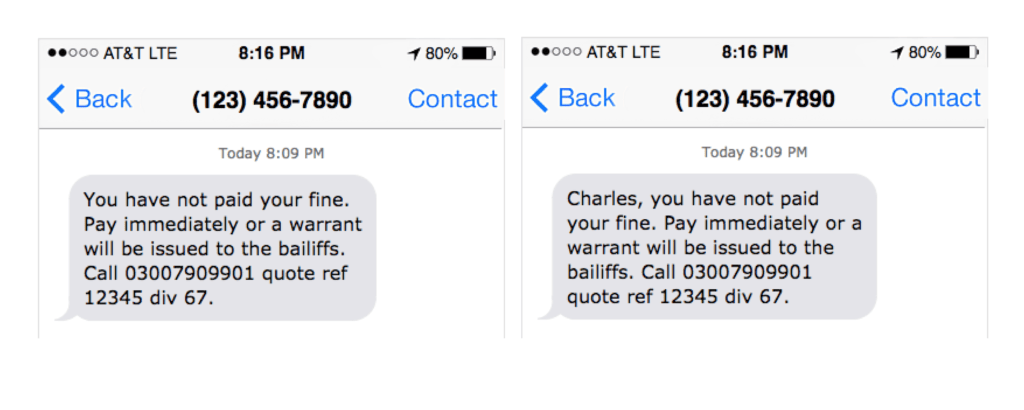 The Behavioural Insights Team and the UK court service conducted experiments to test the effectiveness of low-cost strategies for increasing payment of delinquent court fines. They found that a personalized text message that addresses the recipient by name significantly increased fine payments by
 This example does not constitute or imply an endorsement or recommendation of any product or service by ideas42.
Getting it right:
- Include personal greetings (“Hi, Sara”) and signatures (“James”) in customer outreach, whether email, text message, or other formats.
- Use a personal, casual style where appropriate and acceptable (authoritative tone may be more appropriate in some instances, such as official notices).
Caution!
- People react reciprocally to negative interactions as well. Once a positive connection has been established, be deliberate about how you maintain it (see “Inspiring trust and confidence”).
Capturing Attention Checklist:
Finding specific moments that align with a real-world need can help bring digital financial tools to the forefront of our attention when physical cues and human interaction are limited
Reminders are most effective when they grab people’s attention at the moment when they can take action
A personal touch has been shown to increase response rates and help people stay on top of their finances
Schoar, Antoinette. 2012. “The Personal Side of Relationship Banking.”
